UX Case Study: Analysis of the SociumJob Platform
SociumJob is a platform connecting talents and companies looking for qualified profiles. Each week, the team identifies and highlights companies sharing values of transparency and mutual investment. (see the concept)
The objective of this case study is to evaluate the user experience of the candidate journey, from a UX Designer's perspective, and propose optimization paths through interactive UI components designed to strengthen engagement, clarity, and personalization of the journey, while remaining faithful to the product identity.
1. Candidate Journey: Key Observations
My initial experience on SociumJob reveals an ergonomic and clear platform from navigation. The user interface is functional, facilitating job exploration. However, the information density could be lightened for better visual comfort.
1.1 Discovery and Navigation
- The Home page offers direct access to jobs and companies, with a clear hierarchy of "Find a job" and "Find a company" CTAs.
- Job listings present detailed information about the company (culture, missions, employer brand) and required skills, in line with SociumJob's transparency promise.
1.2 Application Process
The application journey itself stood out for its speed and lack of friction. The application submission process was intuitive and had no superfluous or complex steps, a positive point not to be overlooked for the overall candidate experience.
In summary, the platform offers an effective and well-designed first impression, with appreciable technical clarity. A lighter interface would optimize the experience for a broader audience.
2. Improvement Areas
2.1 Homepage: Strengthen Visual Impact

This homepage reflects a notable effort on brand image: engaging illustration, clear message, and explicit positioning. However, the main call-to-action ("Find a job") could benefit from stronger contrast, and secondary sections would gain from being lightened to guide navigation more effectively.
Suggestion: Add a more marked visual hierarchy between blocks (spacing, contrasts, titles), introduce subtle hover animations on CTAs to strengthen their appeal.
2.2 Candidate Space: Improve Readability and Humanization
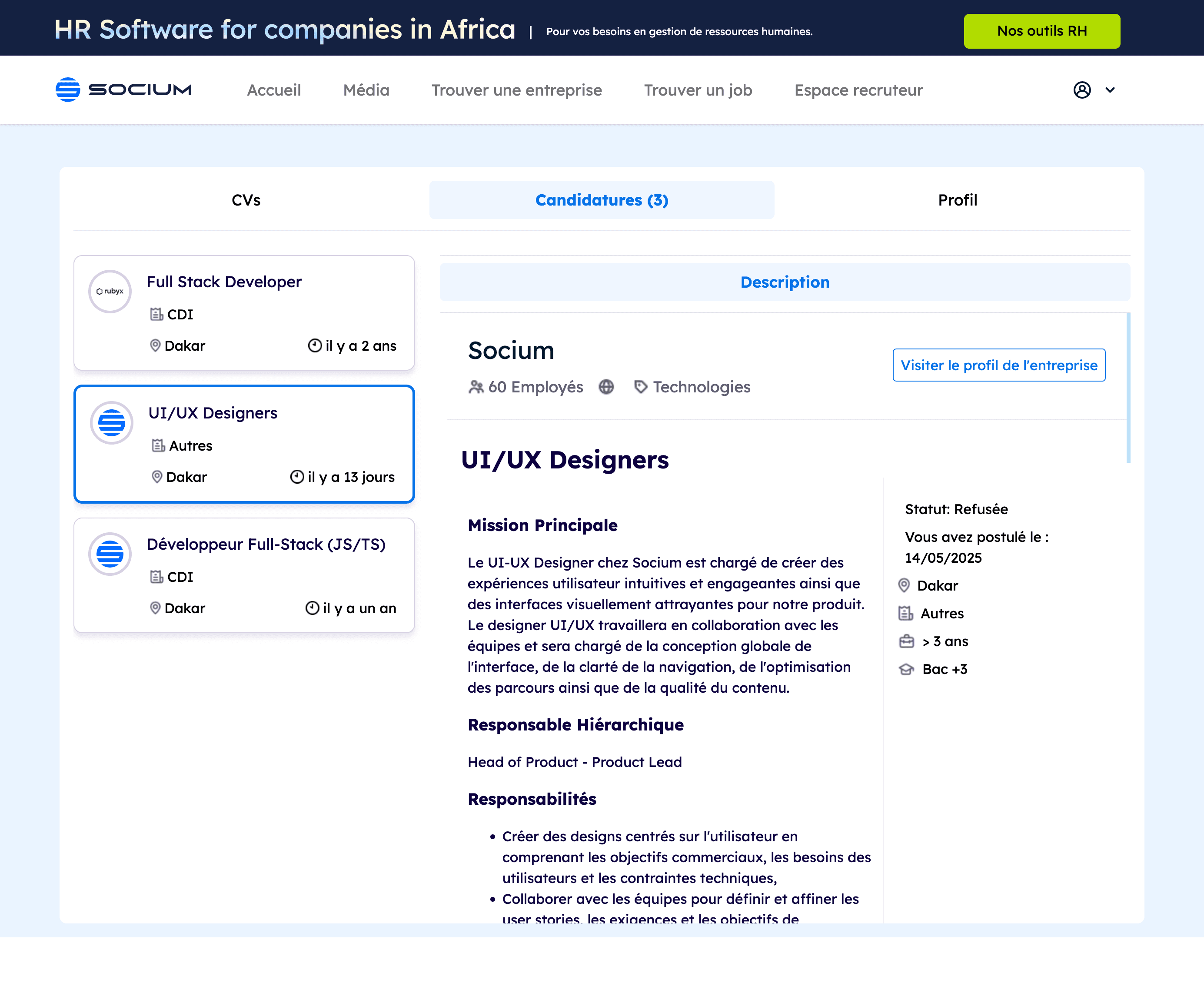
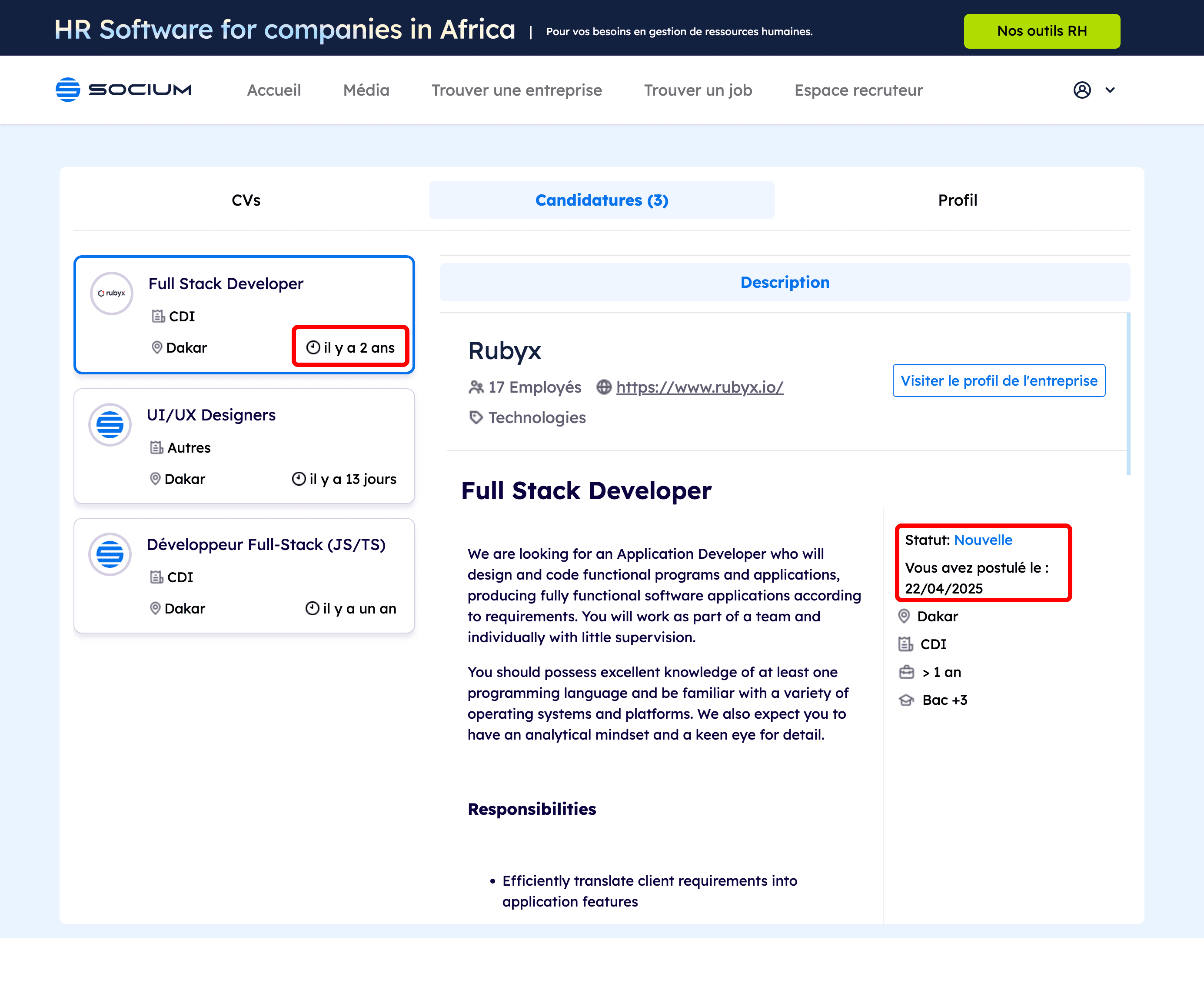
This space shows a clear desire to offer an overview of applications. I appreciate the subtle color code, but it lacks readability to distinguish different statuses. Moreover, the absence of human or narrative elements reduces emotional attachment to the interface.
Suggestion: integrate a more explicit and uniform StatusBadge component, and offer synthetic HR feedback even if automated.
2.3 Managing Expired Offers: Avoid Obsolete Applications
During navigation, it's possible to encounter potentially obsolete or expired job offers, which can lead to wasted time for candidates and increased frustration.
Suggestion: Implement an automatic job validity verification system and clearly display the publication date. Disable the application button for expired offers to avoid any confusion.
3. Humanizing the Interface: Micro-interactions Serving the Candidate Experience
The user experience on a recruitment platform doesn't stop at sending an application. On the contrary, it's precisely at this moment that the interface has a crucial role to play in maintaining candidate engagement, accompanying them, and strengthening the trust bond with the platform. It's essential to transform every interaction, even the smallest, into a useful and meaningful moment.
Here are some concrete proposals to enrich this post-application phase, relying on simple but high-impact micro-interactions
3.1 Visualize Application Status at a Glance: Clarity First
When a candidate returns to their dashboard, they're primarily looking for a clear answer: "Where is my application?" Currently, the information is present, but it requires effort to be read and understood quickly. Immediate readability is paramount to avoid any frustration.
A simple improvement would be to introduce a system of visual badges positioned next to each application: for example, Pending, In Progress, Accepted, Rejected. This type of indicator, color-coded and easily identifiable, would allow the candidate to instantly grasp the status of their journey, without unnecessary cognitive effort.
3.2 Provide Constructive and Caring HR Feedback: Breaking the Silence
One of the most frustrating experiences on recruitment platforms is the silence after an application. Often, you apply, then nothing, even in case of rejection. Yet feedback, even synthetic, has the power to transform this frustration into an improvement opportunity and maintain a feeling of consideration.
SociumJob could integrate a simple internal form allowing recruiters to share structured and encouraging feedback. This form could be designed around recurring criteria such as skill fit, profile clarity, or availability. The goal isn't to burden recruiters' workload, but to offer them a quick and effective way to communicate respectful feedback and potentially useful for the candidate.
This approach would help strengthen SociumJob's image as a human and professional platform, truly concerned about its candidates' journey.
Feedback Candidat
Appuyez sur shift + ↵ ou cliquez sur le bouton pour ajouter
Points ajoutés 0
3.3 Transform a Rejection into an Opportunity
Receiving a rejection is never pleasant. But a platform can play an active role to prevent this from leading to abandonment or loss of motivation.
This component would act as a bridge between the decision received and the rest of the journey: a feedback alert combined with personalized suggestions of similar offers. This block would maintain candidate engagement by immediately opening other perspectives, without them having to restart a new search themselves.
This type of functionality embodies a proactive posture from the platform: it shows that it accompanies the candidate, even after a "no".
These micro-interactions, far from being simple gadgets, respond to key moments of the user journey where clarity, attention, and transparency have a direct impact on trust in the platform. By integrating them, SociumJob would have simple but powerful tools to strengthen its candidates' support, even in moments of doubt or waiting.
4. Transforming the Candidate Experience: Perspectives for SociumJob
This case study highlights the crucial importance of a humanized user experience in online recruitment. By optimizing SociumJob's interface with targeted micro-interactions, the platform could transform the candidate journey into a user relationship based on transparency and respect. These adjustments would allow not only to increase user satisfaction but also to affirm SociumJob's positioning as an actor that would truly accompany talents at every stage of their professional journey, thus propelling the candidate experience to a higher level.